
Glesys
How I used user data to cement UX in a company’s product process
Overview
TIMELINE
Mar - April
2025
PLATFORM
Website
TEAM
UX Designer (Me)
UI Designer
Back & Front-end Developer
Project Owner & Manager
ASSOCIATION
Hyper Island
TOOLS
- Figma
- FigJam
CLIENT
Glesys
MY ROLES
Researching
Wireframing
Prototyping
User testing
Data analysis
Presenting
Glesys
Glesys offers sustainable cloud and infrastructure services from energy-efficient data centers in Sweden and Finland. Their operations run on renewable energy and prioritize low environmental impact.

The Headache
Glesys has long, on paper, been a data-driven product company that prides itself on a research-committed product process. However, in reality, that’s meant a couple hours of market and competitive research at best.
2025 started with a new commitment: include a discovery phase in the development of new products to give research a real, fair chance—with me as their first-ever Product Designer.
The Goal
My task: To research, design, and user test their new product flow “Create a database”.
“This change is brand new to the company. But if we want to be a product company we need to include UX in our product development process.”
Implementation
This product was implemented and went live on the 3rd of June, 2025. So far, a dozen new databases have been set up by users and I’m eagerly awaiting for Glesys to release data on how it’s been performing, which will be updated here, of course!
The Process
February
March
April
Competitive Analysis & User Flow
Wireframing & Prototyping
User Testing & Analysis
User Flow
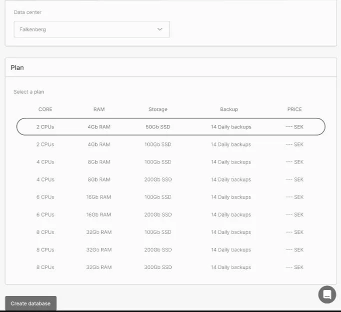
The first thing I did was to sit down with the project manager and sketch out the user flow for “Database as a service” to further understand how users would navigate through the entire flow and where potential bottlenecks could present themselves.

Reduce the Variables
Why mid-fi?
Since Glesys already has an established Cloud UI, I chose to create something that felt familiar in structure but stripped of color, copy, and detail—keeping the focus on layout and interaction.
First, I made a mid-fi replica of their landing page.

Then, the new service itself:

The bottom half of the page:

The Prototype
The ideal number of users for qualitative usability studies according to NN Group is 5, which maximizes the number of usability issues without exhausting too many resources or risking saturation.
The Chosen Five

First time around I received a single ‘yes’, but persistency prevailed and after sending out a second strategic email I landed my five participants.
Significant Results
Previously, users had complained about the “Create” button being hard to find easily if placed on the right side, since on a bigger screen it would slide too far to the right.
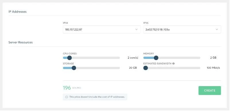
So I put it on the left, since both English and Swedish are read from left to right and most decisions in this design are mostly performed on the left side—users no longer had any issues locating it.
The Usability Test Score
Once all the testing was done, it was time to assign points to each of the tasks in order to pull out the data.
Scoring criteria
✔ 1 point for success
½ 0.5 points for partial success
❌ 0 points for failure
➖for inconclusive/N/A results
Performance metrics
Completion rate (could they finish the task?)
Error rate (any confusion or wrong clicks?)
Time on task (based on the average time)
Confidence & satisfaction (each participant ranked their own performance)
Results
Out of the 5 participants, 3 scored the total amount of points.
The 2 who didn’t where due to prototype errors.
All in all, the total score of the test ended at 25.6 out of 28 points, or 91.43%, which means it received an “excellent” score and no further testing was required.
Reflection
My biggest learning from this project is without a doubt this: Trust the process.
When I stepped into the role as a UX designer in this particular team, I realized at the first meeting that the project manager didn’t see any reason to do user tests, and therefore, saw no real purpose for me in the team.
I convinced him that I’d be doing work on the side and it wouldn’t hinder the team’s progress and got green light.
At the end, when I presented my findings, I was met with a very different attitude.
He was talking about how great it was to hear direct feedback from customers
How 4 out of 5 made the same decisions on a particular choice
How we now had a design that was supported by data.