
Glesys
How I used user data to cement UX in a company’s product process
1
Product Designer
(Me)
Project Summary
PLATFORM
Website
TEAM
1
UI Designer
4
Developers
RESPONSIBILITIES
1
Project Manager
Competitive & market research, wireframes & prototype design, and user testing.
2025
Timeline
February
March
April
Competitive Analysis & User Flow
Wireframing & Prototyping
User Testing & Analysis
Background
Glesys, a sustainable IaaS provider, presents itself as a data-driven company with a research-oriented product process. However, in reality, that’s meant a couple hours of market and competitive research at best.
2025 started with a new commitment: include a discovery phase in the development of new products to give research a real, fair chance—with me as their first-ever UX Designer.

“This change is brand new to the company. But if we want to be a product company we need to include UX in our product development process.”
— Alexander Castro, Head of Product at Glesys
The Headache
With all the possible features that could make it into the new product, which are the essential ones to our users?
The Goal
Launch a Minimum Viable Product (MVP) for a Database-as-a-Service (DBaaS) within three months by defining core features through competitive and market research, creating and validating the prototype through user testing.
Implementation
This product was implemented and went live on the 3rd of June, 2025. This is what the head of product had to say when I caught up with him a few months after the launch:
“DBaaS was the first step toward meeting the bare minimum of essential products we should have. It’s not going to revolutionize anything—it’s a necessity that’s finally been crossed off the list.”
Desk Research
Competitive & market research
I looked at two main competitors: UpCloud & DigitalOcean, and how they built their DBaaS.
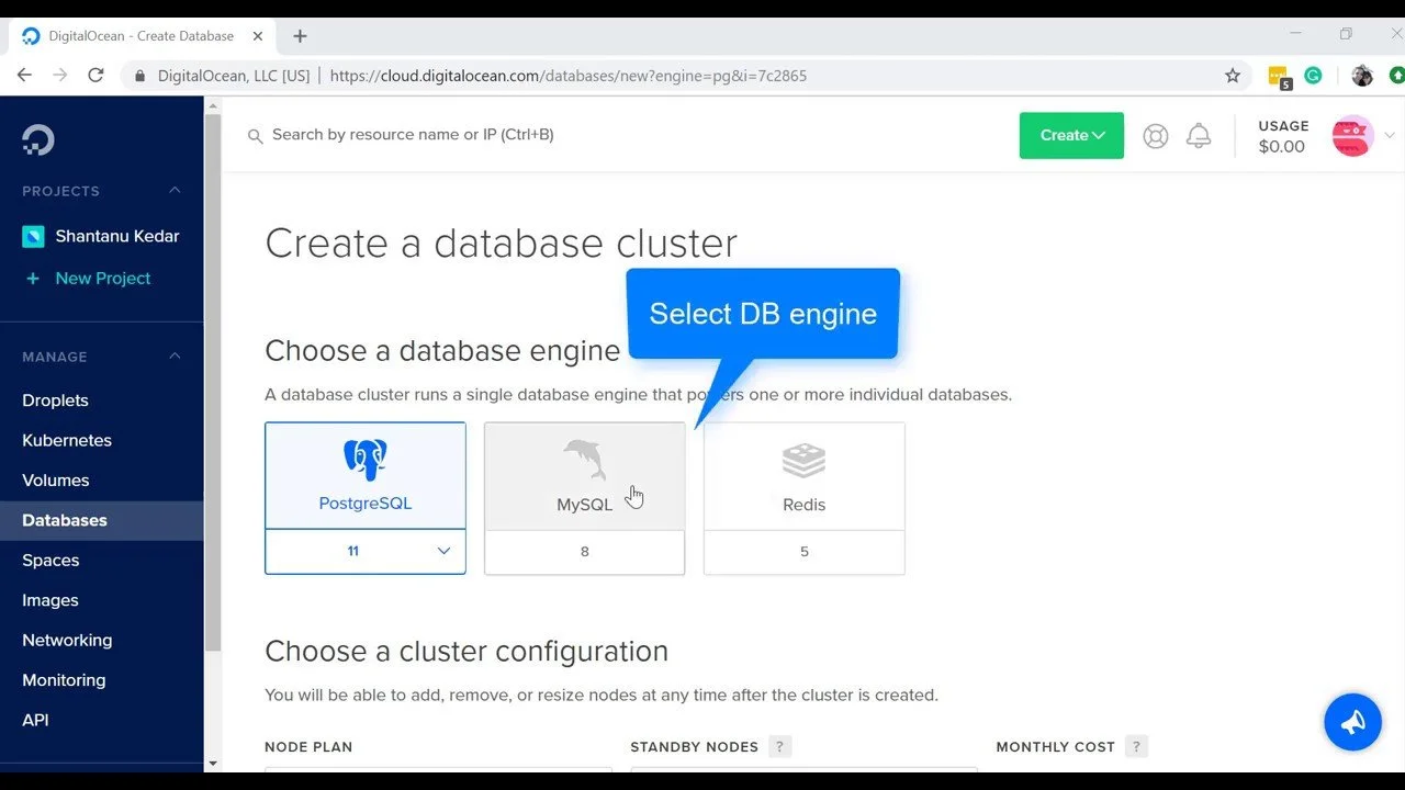

Through studying their DbaaS product flow, I put together the most essential features shared by their two top competitors: naming the database instance, choosing database engine and data center, and pricing plans.
Synthesis Process
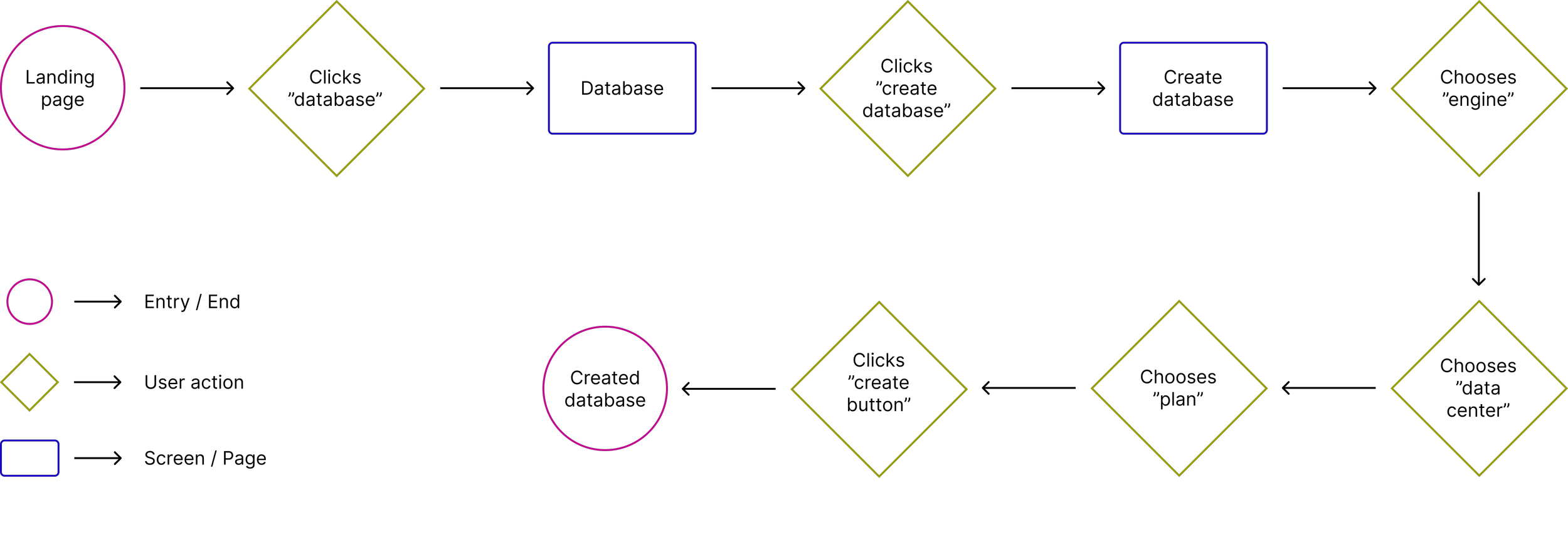
Laying the foundation: User flow
Once I had a clear understanding of which features would make it into the MVP, I sat down with our project manager and created this user flow diagram:
Design Process
Reducing the Variables
Why mid-fi?
Since Glesys already has an established Cloud UI and my test users were familiar with it, I decided to create something structurally and visually familiar—just stripped of color and copy to keep the focus on layout and interaction.
First, I made a mid-fi replica of their landing page.

Then, I designed the new service page from scratch:


I put naming your instance as the first step, because it felt natural to start with giving it an identity.
Secondly, the most important decision is probably choosing which engine the database will run on, so I put that here.
The hardware location is naturally the third step after choosing engine when I looked at the competitors flow.
The last step is choosing pricing plan, which also includes all the specifities.
Previously, users complained about the “Create” button being hard to find when placed on the right side, since on a bigger screen it would slide away to the right.
So I put it on the left, since both English and Swedish are read from left to right and most decisions in this design are performed on the left side.
The Prototype
This step was important to me. A well-functioning prototype is critical for a smooth user testing experience, so I invested the time to make it seamless.
User Testing
Test Overview
Goal
Understanding how easily users can complete the tasks
Method
Usability testing
Type
Qualitative—remote, task-based, moderated
Number of users
5
Test user backgrounds
IT technicians from client companies
Findings
Users no longer had any issues finding the “create” button
The scores showed users had no problems navigating the design
The Usability Test Score
Once all the testing was done, it was time to assign points to each of the tasks in order to pull out the data.
Scoring criteria
✔ 1 point for success
½ 0.5 points for partial success
❌ 0 points for failure
➖for inconclusive/N/A results
Performance metrics
Completion rate (could they finish the task?)
Error rate (any confusion or wrong clicks?)
Time on task (based on the average time)
Confidence & satisfaction (each participant ranked their own performance)
Results
Out of the 5 participants, 3 scored the total amount of points.
The 2 who didn’t where due to prototype errors.
All in all, the total score of the test ended at 25.6 out of 28 points, or 91.43%, which means it received an “excellent” score and no further testing was required.
Final Thoughts
Reflection
My biggest learning from this project is without a doubt this: Trust the process.
When I stepped into the role as a UX designer in this particular team, I realized at the first meeting that the project manager didn’t see any reason to include UX, and therefore, saw no real purpose for me in the team.
I convinced him that I’d be doing work on the side and it wouldn’t hinder the team’s progress and got green light.
In the end, when I presented my findings, I was met with a very different attitude. He was talking about:
How great it was to hear direct feedback from customers.
How 4 out of 5 test users made the same decisions on a particular choice.
How we now had a design that was supported by data.
My takeaways:
Staying calm and thinking creatively, despite my project manager giving me the cold shoulder in our first meeting, allowed me to develop a strategy that benefited the entire team.
My decisions to stay ahead of the curve by studying the research process in detail and suggesting next steps made a huge difference in my success.
And lastly, showing an understanding when to respond to a customer email connected to user testing and when to hand it over to the team’s more senior technicians granted me a trust that made my job so much easier.
Lastly, some words from my mentor:

“Alexander joined us during a pivotal time in our product development journey. His thoughtful approach provided a strong foundation for the next phase and enhanced stakeholder engagement. Alexander’s calm, methodical nature and his ability to listen and adapt made a real impact. He consistently applied UX principles in a way that was grounded, collaborative, and goal-oriented.”
— Alexander Castro, Head of Product at Glesys