
Designing a high-end restaurant brand experience


Project Summary
PLATFORM
TV + Mobile
TEAM
2 UI Designers (onsite)
RESPONSIBILITIES
Brand research, UX heuristics, wireframes, hi-fi & logo design, prototype, design system
2025
Week 1
Timeline
Research
Week 2
Wireframes
Week 3
Hi-fi & Documentation
The background
6-star Michelin was a fictional project where I designed a digital restaurant experience for viewing and ordering from the menu with the goal of radically improving the user experience over traditional paper menus.
Desk Research
Brief research
Our research into what makes a luxury brand brought a few key insights:
3. A unique user experience strengthens a brand’s luxury positioning.
I had a couple ideas right from the bat. I wanted to try a different platform and create an experience where the screen you order from is part of the dining table. A bit similar to this one:

1. A sharp light–dark contrast accentuates the gold, conveys richness, and grabs immediate attention.
I looked at a few different luxury brands and decided I liked the golden feel with a dark background, similar to these:
2. A clean, uncluttered interface reduces cognitive load and streamlines user flow.
After going through some inspirations, I liked this one specifically. The gold with the darker background theme is what I’m looking for.

Design Process
Wireframes
With my research done, I now had what I needed to move on to designing wireframes. Here are some highlights from the main user interactions:
One big improvement from paper menus to digital, is that the user can choose between multiple langauges.

Our competitive research showed a few important features: clickable cards, animated images, and additional information about each dish. A few issues that I noted down that needed attention was how to order more than one of the same item and how to solve the issue of some people viewing the menu upside down (solution further down).

Seeing a need for ordering flexibility, we created an app version, accessible through a QR code displayed on the TV.
A view of the mobile menu.
A simple scrollable solution.

Here’s a first look at the solution of ordering multiples of the same item (final solution below).

High-fidelity designs
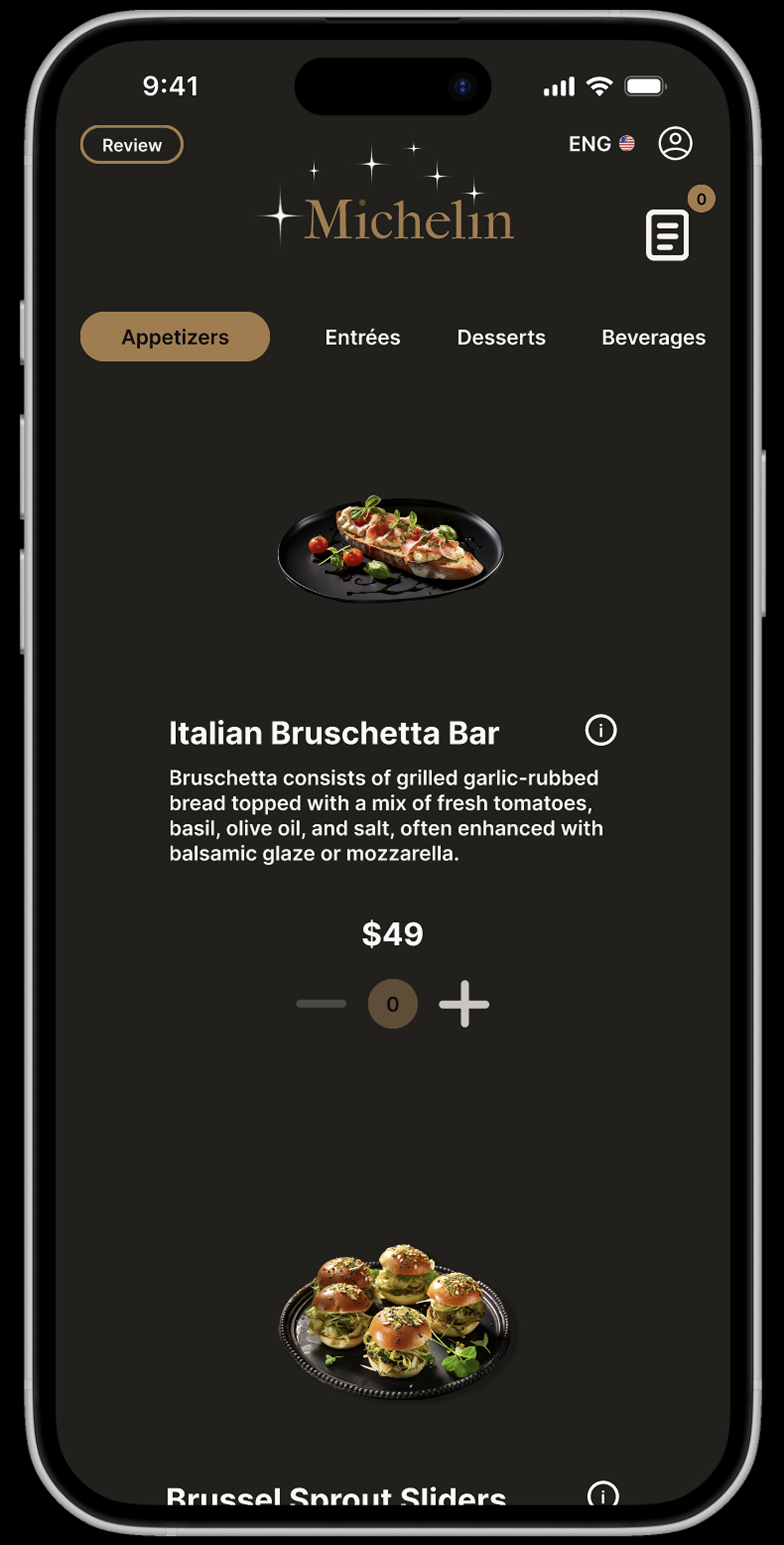
Here’s what the final hi-fi screens look like:
Screen lock: Since the screen doubles as the dining surface, a lock button in the top-left prevents accidental touches while eating.
Logo design: With the restaurant named “6-Star Michelin,” I incorporated six stars into the logo and animated it for the screensaver.
Choosing language.

Entrées with weekly special (scrollable solution).

Appetizers on mobile.

Loading screen prototype for creating an account.
Orders were moved from the bottom to the top-right for standard large-screen placement.
Ordering multiple items: A simple, non-intrusive solution where everything is visible and avoids extra pop-ups.
Instead of the pop-up we saw in the wireframes for ordering multiple items, it’s now just a click away.
I also designed an internal review system.
Screen-rotation buttons on all four corners for increased. accessibility.
Reflection
Mobile standards: The nav bar should be at the bottom, not at the top, in order for the thumb to have better reach for buttons.
Confirmation window: After choosing language and choosing an item, there should be a confirmation window, to prevent user confusion and create a healthy, trustworthy user experience pattern.
Poor accessibility: Despite deciding to stay away from pop-ups (modals) I would still keep it to have a clear step in the user flow where the user picks details about their order, such as how many of the same items.
CTA design: CTA buttons are unnecessarily flat. They could be taller to be easier to click.